INTERVIEW: CHRISTINE HUHN

Christine Huhn (b. 1984) is a visual artist and cultural heritage professional who grew up in northeastern Pennsylvania, less than five miles from the Delaware Water Gap National Recreation Area. This connection to the landscape has deeply influenced her work, which focuses on preserving cultural landscapes through film photography and historic photographic processes.

Can you tell us more about your background and how your interest in preservation and the outdoors has influenced your work and the images you create?I was super fortunate to grow up in the Pocono Mountains in Dingmans Ferry, Pennsylvania, a few short miles from the Delaware River. Dingmans is a forested terrain landscape with flat top mountains. The closest supermarket was a 25 minute drive into town from my house. 40 miles of the Delaware River are designated as a National Recreation Area, much like the Golden Gate National Recreation Area in SF. When I was in my high school photography class, I would visit the Park photographing historic rubblestone building ruins, waterfalls, and lakes. I became deeply connected to the landscape within the Delaware Water Gap National Recreation Area. The rich history was so interesting to me and how the landscape has changed so drastically over the past 20 years. I have a bachelor of fine arts in photography from the State University of New York at New Paltz. After college, and living a few years in Brooklyn working as a product photographer, I moved back home to Dingmans. While I was trying to decide what direction my career was going to go, I found a posting for an internship at the museum within the Delaware Water Gap National Recreation Area. After speaking with the manager at the museum I was offered the internship. He taught me about the field of historic preservation and how I could use my photography to document and preserve the cultural landscape. I went on to graduate school to pursue my masters in historic preservation. Many moves and temporary jobs later, I am now the head of the digitization lab at UC Berkeley Library. My art practice is entirely analog, while my day job is entirely digital. I digitize historic photographs, negatives, maps, and books. I really appreciate the balance of the two. Some of the photographs I’ve had the opportunity to digitize have been by some of my favorite photographers, Edward Muybridge and Carlton Watkins.What drew you to the cyanotype process? Working in the darkroom, creating prints by hand, is a huge part of my artistic practice and who I am as an artist. I was drawn to the historical significance of cyanotype, and the accessible, versatile, and experimental qualities of the process. During the 2020 shelter in place, I could not access my studio and darkroom. I returned to images I had taken in the desert that I hadn’t worked with. I knew I could work with cyanotype in my small 400 sq ft apartment in Nob Hill. I set up a darkroom in the bathroom, 8”x10” trays in the bathtub. I used stackable cookie cool racks for my prints, and I exposed my negatives using the sun off of the fire escape.Cyanotype allows me to create photographic prints by hand, and work anywhere without an enlarger. I’ve also participated in artist residencies where I didn’t have access to a traditional darkroom or an enlarger. During a residency, I photograph in the beginning portion of the trip and then print in the second portion. All of the work in this issue was created during my most recent artist residency at the Santa Fe Institute of Art in New Mexico. 
Can you tell us more specifics about your cyanotype process from start to finish? What are the challenges and how has your relationship to this process evolved?Definitely! First I take photographs with my Mamiya RB67 camera. 90% of the time I work with Ilford Delta 400 black and white film. When I shoot in the desert I always shoot at least a few rolls of color because well it’s the desert! I usually shoot with Kodak Portra 160, most recently I’ve been shooting with Ektar color film. After my film is processed, I scan my negatives at a very high resolution. I go back and forth between my Epson Perfection 550, this little guy is an awesome film scanner, and my digital format camera rig at work. Scanning my own film helps me ensure everything is calibrated correctly when I scan Library materials because I know what my own film “should” look like. Once the negative is scanned and processed into a positive image, I adjust the file to the size I want to print in cyanotype. If I’m creating an 8” x 10” paper print, my file would be 8” x 10” x 300ppi. I then turn my positive image back into a negative. It’s much easier to process the image when it’s positive. I print the new negative onto transparency, then I have an 8” x 10” negative. 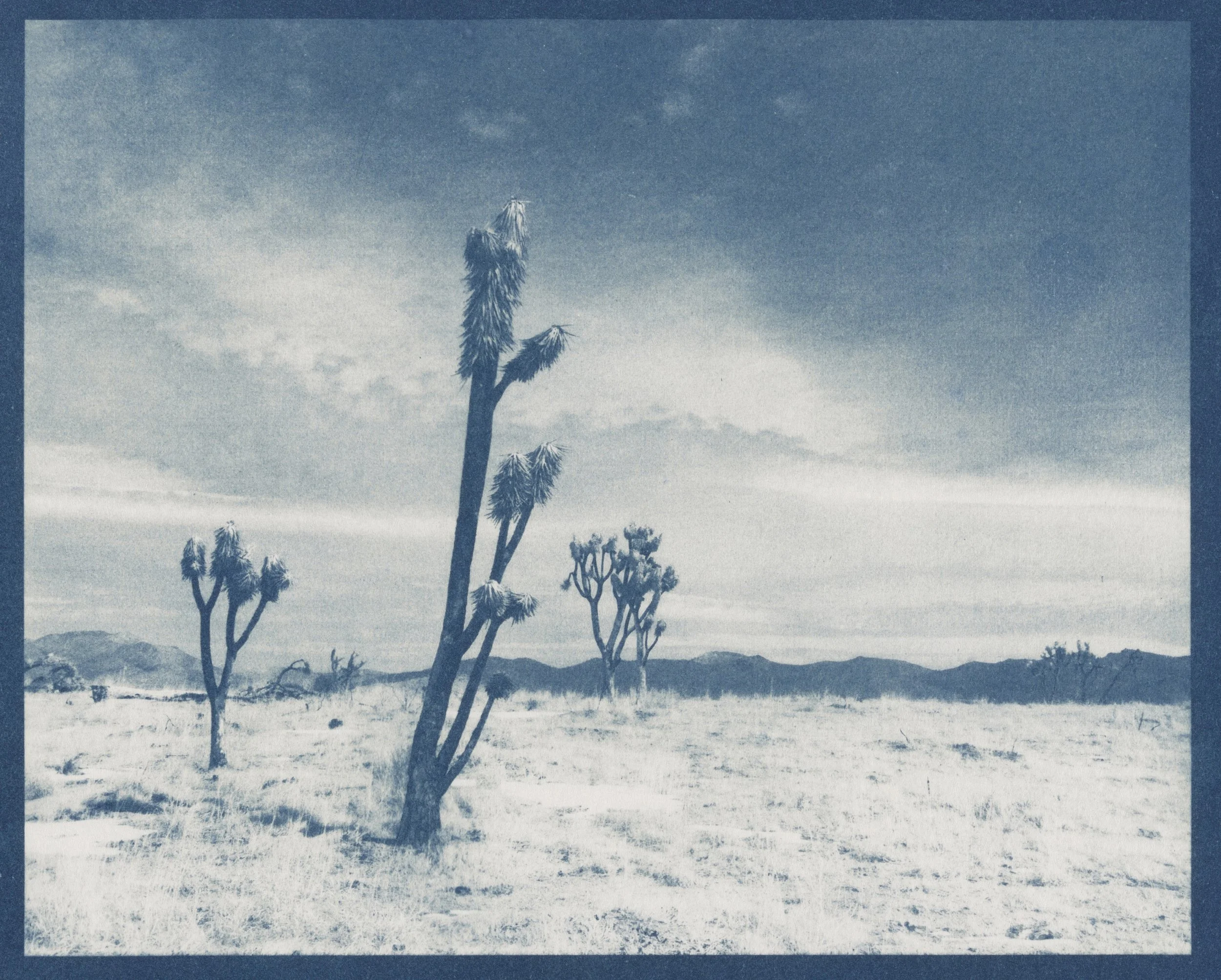

Cyanotype consists of two chemicals equal parts A and B. Once mixed together, they become light sensitive. Using a foam brush, I brush the solution onto the paper. Many artists use a Hake brush, but I prefer the smoothness from the foam brush. Cyanotype isn’t as sensitive to light as silver gelatin, you only need to keep the paper away from UV light. Once the paper has dried, I place negative on the paper chemical side up, and expose using the sun for approximately 5 minutes. A ton of variables contribute to the exposure time: time of day, time of year, location and altitude (California vs. New Mexico), etc etc etc! After my image has been exposed onto the paper, I place the paper in a room temperature still water bath for 5 minutes, and then a second still water bath for 5 minutes occasionally rinse the print throughout the 5 minutes. That’s it! Cyanotype is a super easy process once you get the hang of it. It can also be pretty finicky. Sometimes I do everything right and my print doesn’t come out! Because I’m a super precise silver gelatin printer, I take cyanotype for what it is. If there’s a blemish in the print, I just go with it. It’s the nature of the printing process, and I think it took me a long time to come to terms with that. My cyanotype work has evolved to printing on fabric and creating large wall hanging quilts. When I work in this way, I am enlarging my image to the final object size, however, I divide the final image into equal 8” x 10” pieces. I print each piece individually and then sew them together to create the quilt. It’s super challenging to match up the images on each piece because the fabric stretches and shrinks every time it becomes wet. The larger the piece, the more pieces, and the more challenging it becomes. It’s also extremely difficult to get the exact exposure for each tile. In this case, sometimes I just go with it too. Although the perfectionist in me has reprinted tiles many times in order to ensure the exposure matches throughout the quilt. 

Famously, cyanotypes have the distinctive blue tones. Some of yours have a variety of colors & tones. How do you achieve that effect?Annette Golaz, a swiss photographer, invited several artists including myself to contribute work to her book, Cyanotype Toning: Using Botanicals to Tone Blueprints Naturally. I had never toned a cyanotype print. I was super intrigued by the thought of using natural botanicals to alter the historically blue cyanotype prints. There was a lot of experimentation. In my case, I also wanted to tone fabric, and each botanical reacted differently with paper and with the fabric. It was important to me not to use bleach, to keep my process as environmentally focused as I could. That added the layer of knowing what botanicals toned better with under exposed prints and which toned better with over exposed prints. Madder root is historically used to dye fabric, so I use this plant a lot! It’s also found at the UC Berkeley Botanical Gardens, which is really cool. After I create the cyanotype, I place it in a specific temperature botanical toning bath for upwards of an hour. Each botanical temperature and toning time varies. The botanical baths are basically teas. You steep the plants in boiling water for 15 minutes, strain, and then pour the toner into a plastic tray to tone the print. After the print is toned, it’s washed in a room temperature water bath and layed out to dry. I wanted to show how different botanicals alter an image. During my residency at the Santa Fe Art Institute, I printed a single image four times and toned three of the prints with different botanicals, keeping one of the prints as an untoned cyanotype. I’m super drawn to the way they look framed together as one piece.
What advice do you have for people interested in exploring cyanotypes? And how do you strive to make the process accessible? I think taking a workshop is the best way to jump into the cyanotype process. There are several artists throughout the Bay Area, including myself, who teach cyanotype classes. Workshops can definitely be on the pricier side, depending on which one you’re interested in. Youtube is an excellent resource for cyanotype printing. So many artists are into the process right now. There are also several books I would suggest. The Christina Z. Anderson series of books on historic printing processes are amazing. Annette Golaz’s book is a part of the same series. The books are structured with an intense technical Part 1. Part 2 focuses on artists working with the process. They talk about their artistic practice and process. This section also includes extensive examples.When I teach cyanotype, accessibility is one of the most important things to me. All of the materials I use can be obtained for less than $20, including the paper. I use Strathmoore 400 Printmaking paper pads because they’re easy to find and they’re really inexpensive.
originally published in PRINT IN THE ALTERNATIVE ISSUE #6, SEPTEMBER 2023
INTERVIEW BY NORA LALLE